A large family grew up in this early nineteenth century villa, standing close to the course of the Thames where it runs into London from the west. Most of these children have come of age but none have completely left yet, and their discarded winter hats and scarves are tidied and wrapped around the necks and heads of the entrance hall’s three marble busts, the lares and penates of the house.
The rooms in this benign and tolerant household are furnished and decorated with uncommon style. The children’s mother inherited quantities of beautiful things from her own mother and she and her husband have added many more of their own.
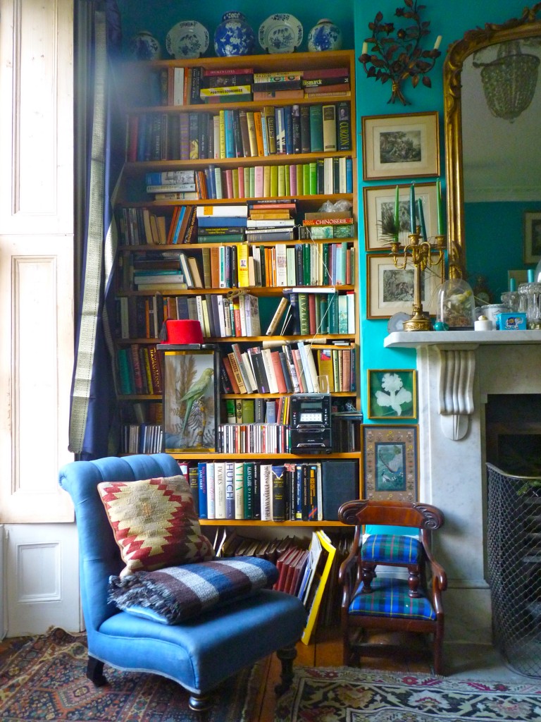
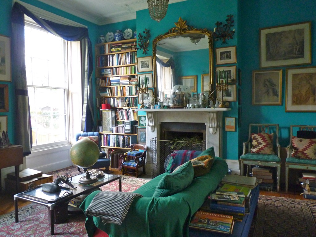
In the double Drawing Room light pours through two pairs of long sash windows, one at the front and the other on the garden side. The walls are a vivid deep turquoise on the garden side and a strong jade green in the room at the front. I doubt that Farrow and Ball does any shades half so nice. There is another flash of green in the plumage of the African parrot in its glass case, iridescent blues in the humming birds under a glass dome upon the chimmneypiece and pea green candles in the candelabra. But these are lived-in rooms with surplus possessions kicked under the sofas.
The householder and decorator writes :
‘I think I am a colourist and I thank my dear mother for influencing me and all her children with her tremendous style and colour sense, which reached its peak in the 1960s largely using the new Conran paints.
I find it hard to have just white or the dreaded magnolia on walls. I have had a thing about peacock colours for quite a while and was pleased to let rip in green and turquoise in the double drawing room, courtesy of good old Dulux. The colours are rather alarming and would put off most sane people, but they are dampened down many pictures (which always thrive on block colour), and the room certainly enjoys an added wow factor because of the colour way.
I would always counsel colour for a decorating statement, especially if the decorator doesn’t own many pictures or much clutter. You have to have something for the eye to latch on to.’
(continued below)

At the half-landing window, glazed chintz curtains are a William Morris design, long since out of production.
She continues :
‘I would say for me, the best colour in the world is yellow which is so versatile, gives light and generally enhances a room (see bathroom). I don’t go for white, tho it has its place. The main bedroom stayed white because I was lazy. Initially I was going for cinnamon or biscuit – but the pictures, furniture and orange, yellow and gold draperies make the room sufficiently interesting without colour on the walls.
My next room? It is time for a change and I would use a blue heading for navy, lighter blues and then either yellow (trad but what a combo), green, or even ochre and creams.’

and Socialist-Leninist statement art in the downstairs gent’s from the student protests of ’68, on walls coloured an appropriate orange-red.
Copyright bible of british taste.
Excerpts and links may be used, provided that full and clear credit is given to bibleofbritishtaste, with appropriate and specific direction to the original content.


HOLY MOLY THE BEST EVER YET!!!
Thank you, dear Ben, for this enthusiastic endorsement!
Love it! Want to change the colour of my living room instantly. And all of once don’t mind my flat being too full.
I am so glad, and I do agree.
Amazing colours! Rooms look great!
The yellow bathroom and green in the stairwell would make anyone’s heart sing.
Care to expand on what paint was used in the bathroom, if still in living memory? That yellow is brilliant, but it is SO hard to find a rich yellow.
oh thank you for colour and clutter… especially the greens – they are so happy!
This is great. I love the colors.
Oh what a happy childhood those five kids must have had!
I’ve just discovered your post via Ben Pentreath’s blog and really enjoyed it. I’m French and used to receive issues of Country Homes and Interiors in the 1990s (which I’ve preciously kept and still consult for inspiration). At that time, it was full of pictures of interiors with colour, style, profusion of antiques, textures and patterns, and the warmth of cosy homes, no matter the trend “en vogue”. The magazine is no longer to my taste and except in the World of Interiors now I no longer find these quintessential English long lived-in interiors (not necessarily in fashion I admit) in magazines. White and grey and minimalism or bad taste pinky “super shabby chic” with its painted furniture seem to be the common rule now, while I think bold and rich historic colours enhance so well antiques and beautiful art objects. I confess I like old interiors packed with antiques. I also like “old fashioned” wallpapers which are more and more difficult to find as even historical designers tend to move towards this grey/white/cream trend of colours and simplify patterns too much. All this to say that your post is great and brings me back to good all times with this interior of character. More of this kind please!
Someone said they had seen the our rooms on another website so I thought I would take a new look at BBGT.
I liked the way Ruth just took the photos, bits and bobs and all.
I have to say it seems to me they look better than the real thing, a la Marshall Mcluhan. The colours are more vibrant, more striking.
It’s appropriate to comment now because the yellow bathroom is no more.
We are upgrading it and are more influenced by modern trends with a lot of white tile and a hint of brown on the wall, kind of subtler, but there are still walls to decorate with mirrors and pictures and a small arm chair in white.
The last child has moved out and so we are playing at doll’s houses again and will turn his white painted bedroom into the Sunset Room, facing west. We want to try to do a really stylish sitting room: less clutter but quality artefacts therein.
There are some old blue toile de jouy curtains ready for use and a neat red chesterfield that could come out of wraps, sort of a Union Jack which way, with white walls, but would prefer not to do fall back on white. We’ll have to think. Wish us luck.
Anyway, good for R to have woven this rich website, always compelling.
What an inspiration!!!
Absolutely inspirational ! I have always used vibrant colours for my homes. Having just moved into a lovely Georgian property shall be using this wonderful website as a template
I’d like to subscribe to your new posts!
Wonderful site – thank you for sharing your beauty !!!
How lovely to have come across this log. Am rationing my reading to spread tbe pleaure out, and inerested to see that there are a couple of very recent comments to this post from 2013. So nice to see houses that real people live in, and not apparently too much deliberately styled or curated.
Never seen paint like this in America… I am inspired!
Lovely colour in the drawing room
WHAT IS THE NAME OF THIS DULUX COLOUR ?