Arriving one Easter at Veere Grenney‘s scintillating house in Tangier, Gazebo, I was curious to know who the other guests were. A bedroom door was flung open and Daniel Slowik appeared, smiling beautifully beneath a Panama hat. After we left Sunday church to purchase toothpaste and became lost in the Grand Socco’s fish market I was completely smitten by his exclamations of mild humorous alarm. Back in England I found that he was a brilliant decorator and that he and Benedict Foley – a.prin.art – tho in great demand – were the most perfect pub companions. There have been weekends staying at their Pink Cottage on the Suffolk-Essex borders where the cobalt blue four poster belonged to Cecil Beaton and the antique patchwork curtains in my guest bedroom are the most beautiful I have ever seen. Daniel’s approach and sensibility as a decorator is all-of-a-piece with his character and domestic style. He was born and bred for this. Here he explains how, and why.
~ NOW READ ON ~
By Daniel Pieckielon Slowik
My formal relationship with the decorating company Sibyl Colefax & John Fowler began in 1997 with an assistant’s position in the antiques department at 39 Brook Street, my informal relationship had started years earlier with a school prize for History of Art for which I chose John Cornforth’s brilliant book, The Inspiration of the Past. With its two chapters on John Fowler I was immediately catapulted in to the world of Colefax country house chic and all the chintz, frills and trims. Understated grandeur and low key luxury meet high camp, I’ve never looked back!
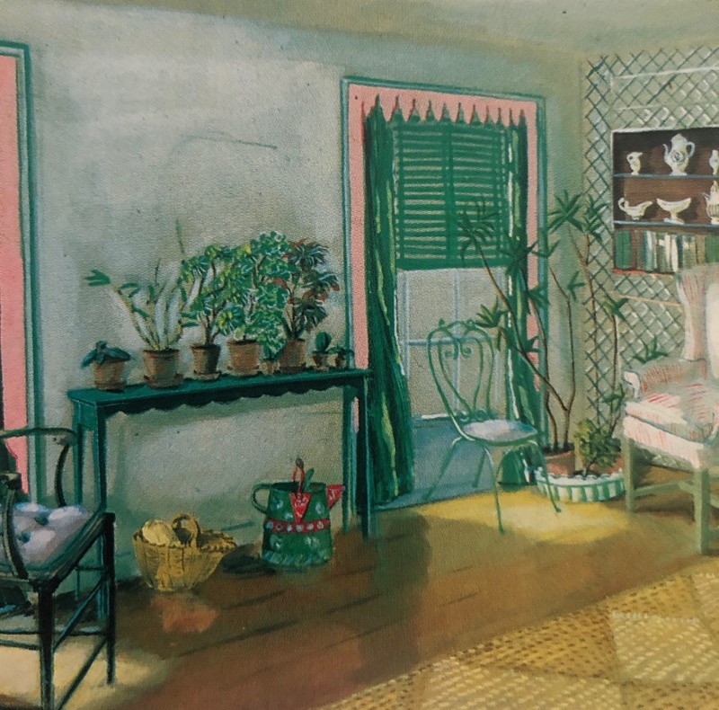
Humble Elegance: John Fowler’s Kings Road shop in the 30s, understated and decorative. The scalloped side table and Venetian Stripe blind fabric are both things we still make today.Those were the heady days of the late 80s and 90s when the Country House look was de rigeur. Everyone wanted a piece of the action, from a New York triplex to a terrace in Fulham, regardless of scale or context, and derivative versions often ignoring the high standards Fowler has set became associated with the look. A recent revival of interest in John Fowler’s work has also in some cases revived the spectre of the derivate style as people look to social media images without really evaluating the source of those images or the original quality. Context as ever is key and what was good then will be good now, and vice versa!
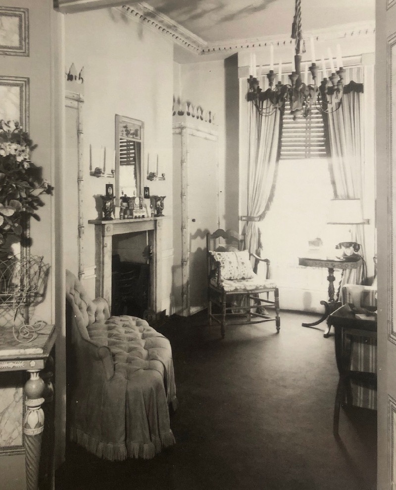
Another room in the King’s Road shop. The same Venetian Stripe fabric is used here as a blind again.
Maintaining high standards in challenging times has been an ongoing theme of my career from the Age of Imitators, through the Chuck out the Chintz noughties, the new Age of Imitators, and into Lock Down, but I have always been mindful of the creative response of John Fowler to troubled times. Neither between the wars in his early days of decorating, or then at the start of the company’s ascent after the Second War, were easy times for any business. As we sit here now in an uncertain world the taste of John Fowler and his love of ‘Humble Elegance’ during those austere early years has much relevance.
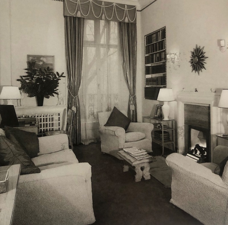
A London flat decorated by Fowler in the mid 30s with upholstery covered in Terry towelling!
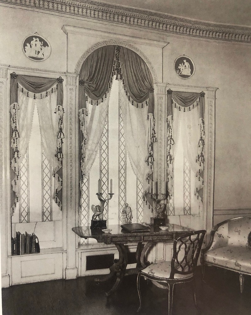
Michael Redgrave and Rachel Kempson’s London home c.1945 with inset curtain treatments, to use the minimum of fabric and the emphasis on trim for a full effect.
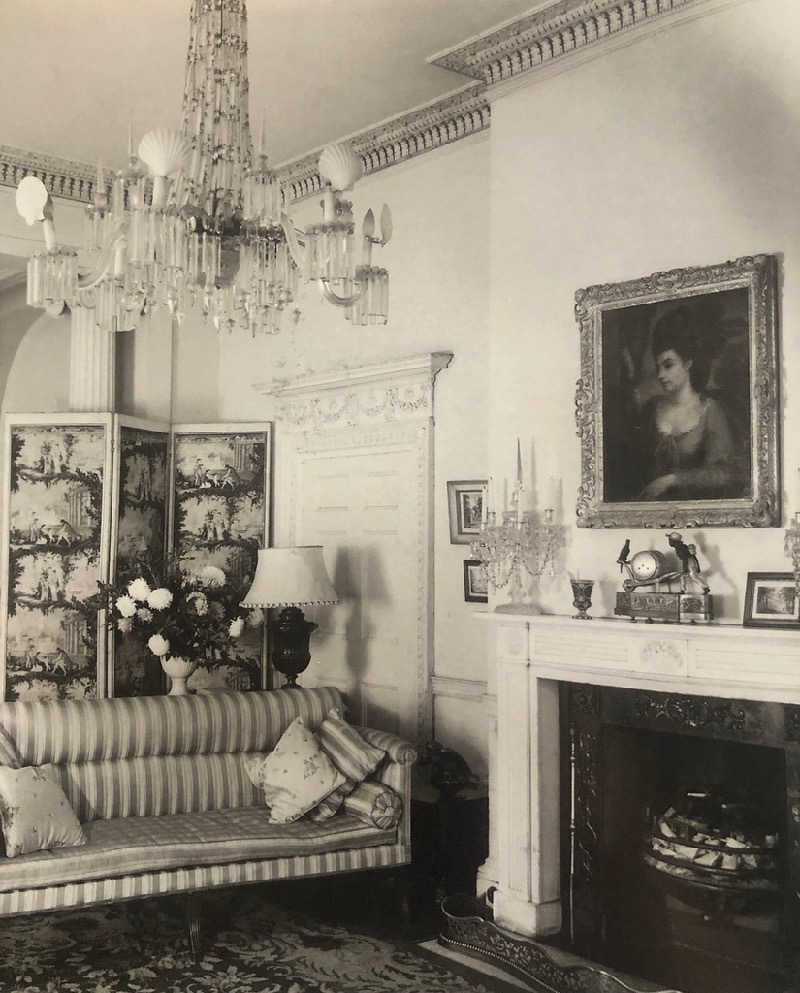
Another view of the same room. Scallop shells were used as playful shades on the otherwise grand chandelier.
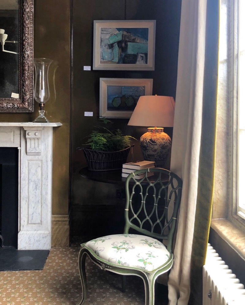
The chair at the desk came back to our new shop in Pimlico Road last year. (What was good then is good now!)
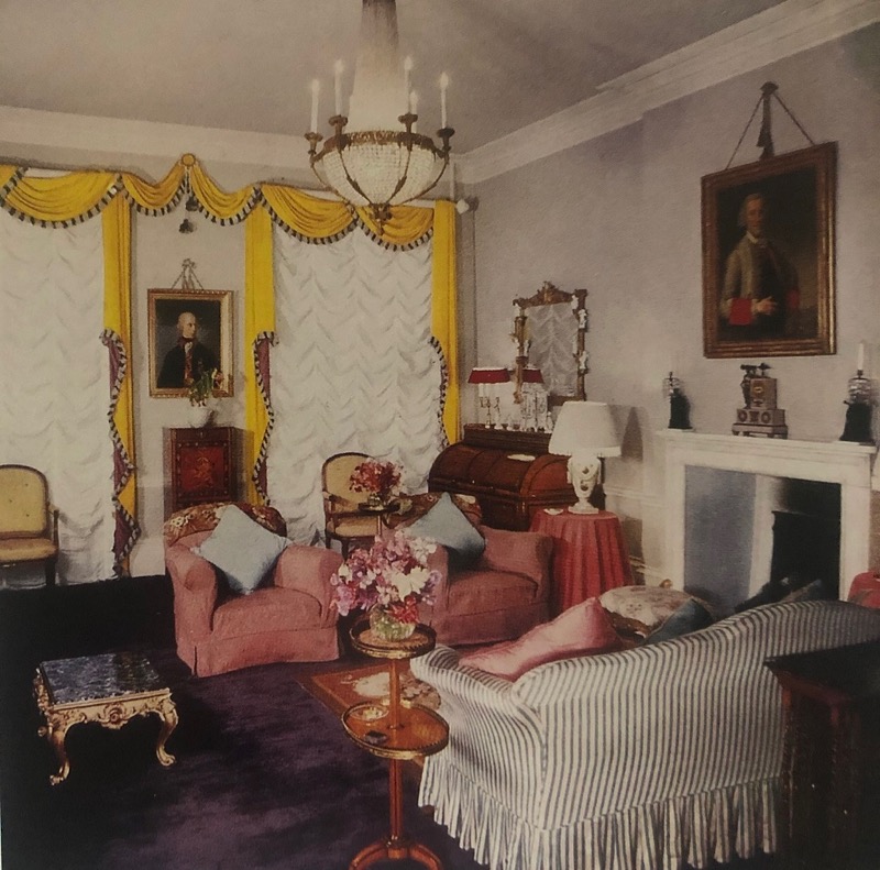
Another early project by Fowler with elaborate curtain treatments designed specially to use less fabric. The emphasis here again is the use of colour and contrasting trimming.
Fowler’s ‘look’ was essentially a creative response to limited resources, repurposing, renewing and reworking. Original thinking and synthesising source materials rather than just copying something else without really understanding it. Trimming curtains as advocated by Fowler is based on the Regency love of embellished window treatments, but also on dress making from the 1850s through to the 1880s, John obsessively researched historic costume and collected quantities of Victorian and Regency dresses at a time when they would have been being thrown out as people cleared the ephemera of a previous but relatively recent age . He explored how to make a simple material into a complex effect, the same fabric was made into a trim or a ruffle to elaborate a curtain or chair, a plain piece of cotton was dyed to match a colour in the main fabric for further trim. The underlying approach was the same whether the company worked on large houses or more modest, rather than taking a ‘get the look’ shopping list with a sliding scale of quality. Each component part of the room, however humble or grand, was considered in relation to one another to create a perfectly conceived whole.
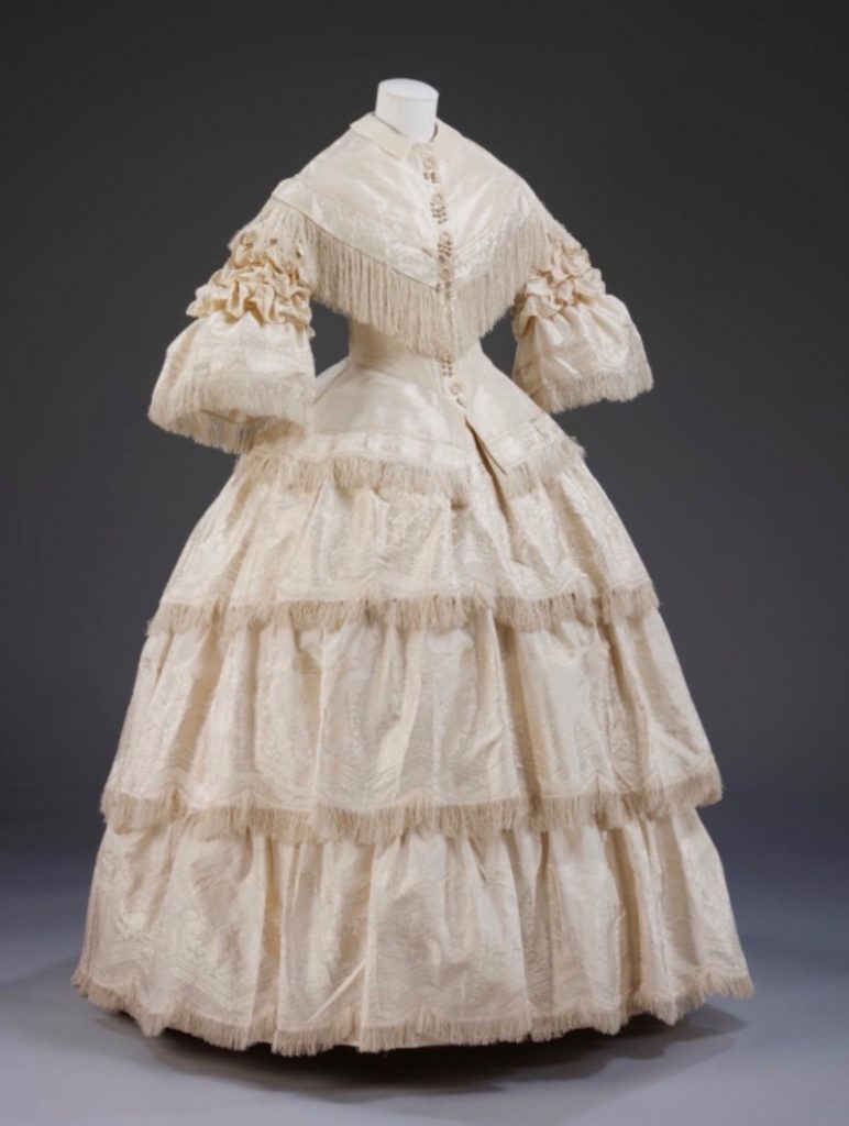
Dress made in England c.1857. Figured silk trimmed with silk fringe, buckram stiffening. V&A Collections.
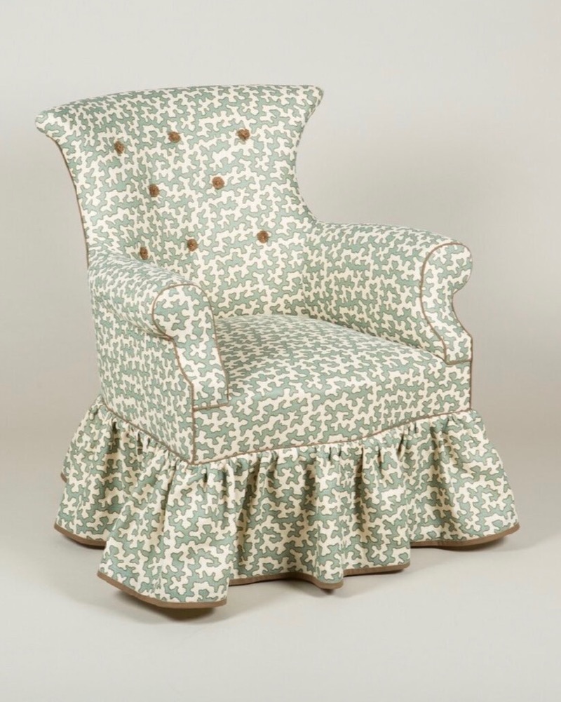
The Avery armchair, which we still make at Sibyl Colefax. A typical design by Fowler. His synthesising approach is evident in the references to both antique models of armchair, and dress trimming techniques.
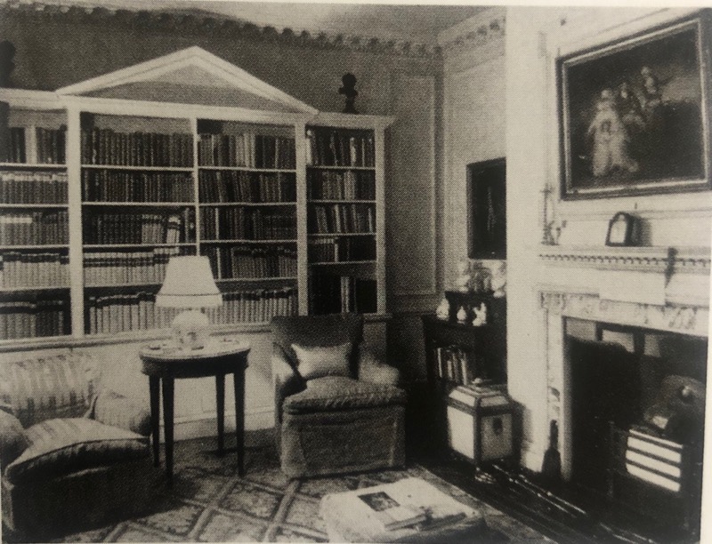
Nancy Lancaster’s house in Charles Street c.1944. The armchairs were covered in re-purposed dyed damask tablecloths.
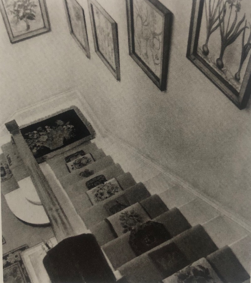
The staircase at Charles Street. The carpet is in un-rationed lime green felt with applied needlework panels.
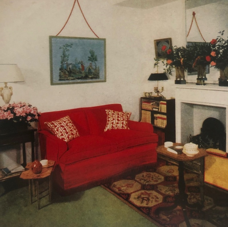
The actress Joan Dennis’ tiny flat in Shepherd’s Place, Mayfair. c.1952. Joan was one of John’s earliest and most loyal clients, and they worked together on many houses together over the years, the sign of a good client-decorator relationship
I have seen a marked positive response to interiors that have a sense of continuity and longevity of late. The understatement, originality and durability of the early days of Sibyl Colefax have as much resonance as ever. It is something we need in our homes right now with the current restrictions of movement, as we evaluate what is possible – and worthwhile – asking people to make, but also going forward with a sustainable outlook for the future. Although the effect of Fowler’s mature work can be Full-Look-extreme at times, the existence of a number of schemes such as Seizncote and Cornbury Park show remarkable economy of materials. If the making is closely examined it still speaks of his careful and appropriate approach, and the durability of both the physical fabric used, and of his designs.
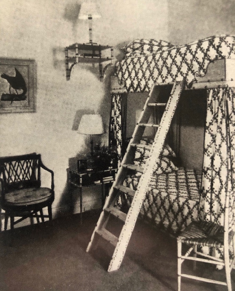
Dennis’ Shepherd’s Place flat was tiny and Fowler applied his usual creative flair, using small furniture to divert the eye and even bunk beds in the bedroom! All of this trimmed and painted beautifully, demonstrating his detail based approach.
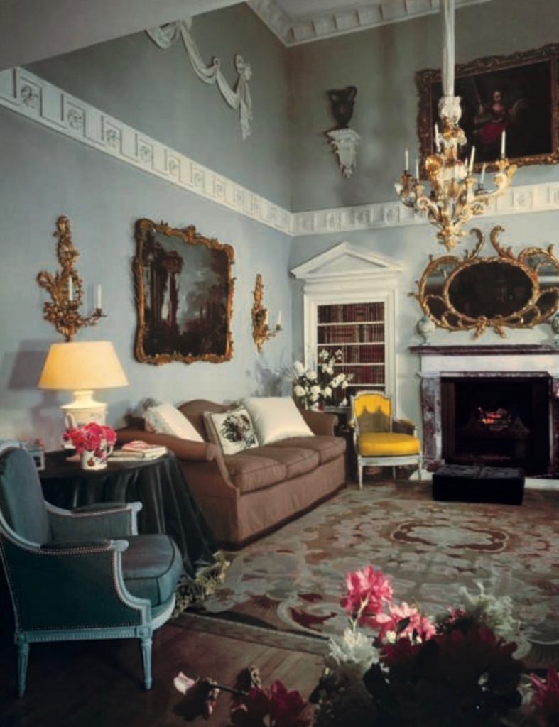
43 Hays Mews, Dennis’ next Mayfair address, published in House & Garden in 1956.
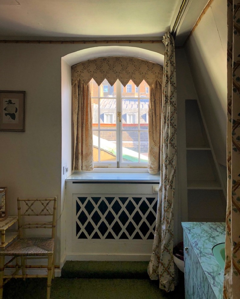
A photograph taken of Hayes Mews last year (I’ll come to that). A careful eye will notice much from the tiny flat repurposed by Fowler. The furniture and hangings here are from the Shepherd’s Place bedroom.
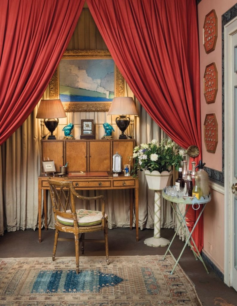
Another photograph from Hayes Mews in 2019, a familiar chair sits at the Bonheur du jour
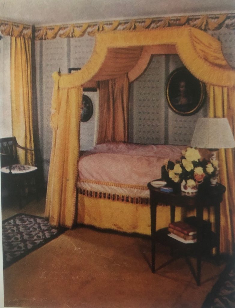
The same familiar chair appears far left in Joan’s bedroom in Hayes Mews, again from the ‘56 H&G article.
Hays Mews was bought by Mrs. Drue Heinz and her husband Henry J. Heinz II from Mrs Dennis in the 60s with the contents in place. Drue Heinz much enlarged the house over the years, but she appreciated Fowler’s work so much that she kept his schemes intact with few changes. The quality of the work executed by Fowler for Dennis stood the test of time, the contents were sold by Christie’s on Mrs. Heinz’s death at 103 last year. The house was also recorded by Simon Upton for the World of Interiors.
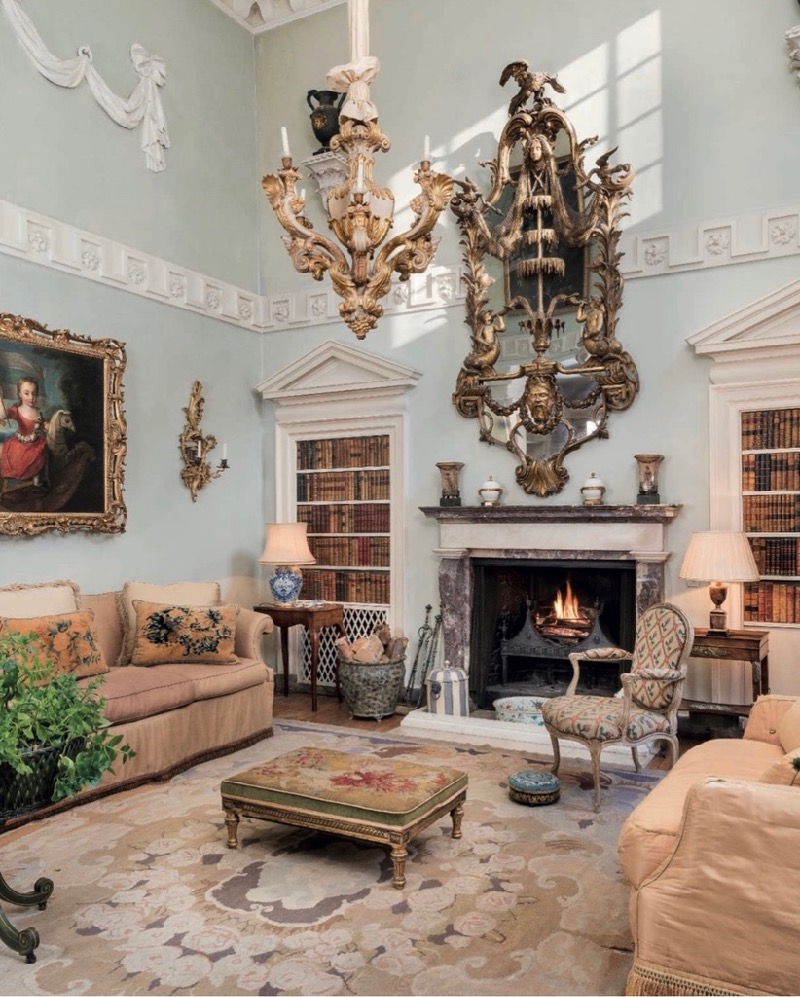
This image was taken of Hayes Mews in 2019 by Christie’s before they began to catalogue the contents.
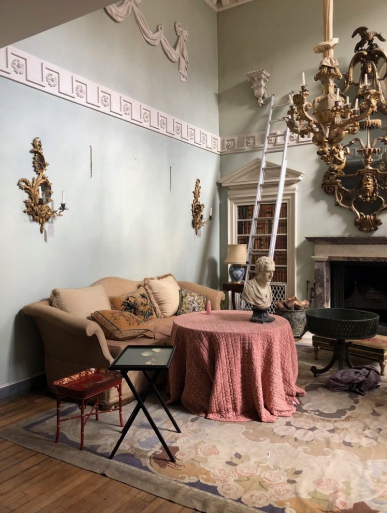
A photograph I took at Hayes Mews when the contents were being removed by Christie’s. I was lucky to see the ensemble just before it disappeared, to advise on Fowler’s work there.
Some people might find the idea of interior decoration in these times rather frivolous, particularly if we are dealing with products that are then chucked out in a few short seasons, adding to the enormous pile of wasted material resources that the last 20 years has created. However consider the life of the little table from Joan Dennis’ Tiny Flat below, still being used, but now being enjoyed in our cottage. It will probably need to be repaired at some point before too long, but it can be firmly described as Materially Good Value!
So when you buy, choose something to last, something considered and timeless in design, something useful, remembering beauty can be a utility: it could be the start of decades of enjoyment, in your current house, in your future homes, possibly enjoyed by your children and theirs. Resources well spent and well appreciated are the basis of what we need, for life and for the future.
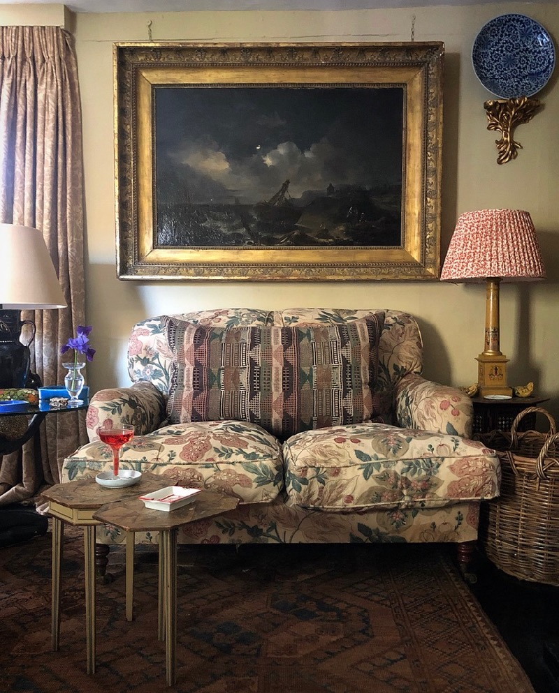
I am indebted to Martin Wood, The V&A, Christie’s, House & Garden, & World of Interiors for those images above which are not my own.
Daniel Pieckielon Slowik, 2020

LOVING THIS TOO xxxxx
So enjoyed
Never truer said, all the references and images are fascinating. Xxx
marvellous daniel. love that dear little table too…
more stories please.
I love this story too Daniel and Ruth – and seeing the pieces continuing/surviving.
I love this story too Daniel and Ruth – and seeing the pieces continuing/surviving.
Fabulous, Daniel. Enlightening.
Thank you Daniel. A fascinating look at some of Fowler’s work, with an enormous amount of good sense tucked into the final paragraph “So when you buy…”!
Fascinating and well written article
Just wonderful! Beautifully written with a knowledgeable, sensitive and inimitably quotable point of view!
lovely, new insight into the great man
Terrific! I thoroughly enjoyed and appreciated this article!
What a nice break from all the desperate fabulousness out there. Enjoyed this immensely. Many thanks.
Fascinating story as are all your posts on Instagram. The
Reading when young the Inspiration of the Past was a revelation for me too
Thank you for this wonderful, timely trip down memory lane.
I have long been a student of interiors, and Fowler was unquestionably one of the greats. He was a perfect man for his time, resourceful and sensible and understanding of what is required of a room. His unwavering insistence on high standards in furnishings and materials does him credit, because poor quality damns a room to mediocrity.
The lockdown is difficult. I long to embrace my family, and I deplore the dehumanisation of masks and the paranoia of social distancing, but beyond that, I am content. I believe it is because our house gives me much of what my soul needs: a jumble of beautiful artwork, antiques, carpets, colour, books, music, plants, comfort, and companionship (my husband and our dog).
I thank God we are maximalists, and I agree with you that the tide is turning. The cold, spare look has already endured far longer than it deserves, and this virus may accelerate its demise.
Wonderful story .. thank you
Great article Daniel. John Fowler could certainly offer some good advice for decorating during lockdown!